AMAZON multi-meters discounts AMAZON oscilloscope discounts
<< cont. from part 1
3. Data Visualization
How can we convey data to users effectively? Data visualization aims to communicate data clearly and effectively through graphical representation. Data visualization has been used extensively in many applications-for example, at work for reporting, managing business operations, and tracking progress of tasks. More popularly, we can take advantage of visualization techniques to discover data relationships that are otherwise not easily observable by looking at the raw data. Nowadays, people also use data visualization to create fun and interesting graphics.
In this section, we briefly introduce the basic concepts of data visualization. We start with multidimensional data such as those stored in relational databases. We discuss several representative approaches, including pixel-oriented techniques, geometric projection techniques, icon-based techniques, and hierarchical and graph-based techniques.
We then discuss the visualization of complex data and relations.
3.1 Pixel-Oriented Visualization Techniques
A simple way to visualize the value of a dimension is to use a pixel where the color of the pixel reflects the dimension's value. For a data set of m dimensions, pixel-oriented techniques create m windows on the screen, one for each dimension. The m dimension values of a record are mapped to m pixels at the corresponding positions in the windows.
The colors of the pixels reflect the corresponding values.
Inside a window, the data values are arranged in some global order shared by all windows. The global order may be obtained by sorting all data records in a way that's meaningful for the task at hand.
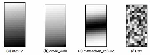
FIG. 10 Pixel-oriented visualization of four attributes by sorting all
customers in income ascending order.
Example 16 Pixel-oriented visualization. AllElectronics maintains a customer information table, which consists of four dimensions: income, credit limit, transaction volume, and age. Can we analyze the correlation between income and the other attributes by visualization? We can sort all customers in income-ascending order, and use this order to lay out the customer data in the four visualization windows, as shown in FIG. 10. The pixel colors are chosen so that the smaller the value, the lighter the shading. Using pixel based visualization, we can easily observe the following: credit limit increases as income increases; customers whose income is in the middle range are more likely to purchase more from AllElectronics; there is no clear correlation between income and age.
In pixel-oriented techniques, data records can also be ordered in a query-dependent way. For example, given a point query, we can sort all records in descending order of similarity to the point query.
Filling a window by laying out the data records in a linear way may not work well for a wide window. The first pixel in a row is far away from the last pixel in the previous row, though they are next to each other in the global order. Moreover, a pixel is next to the one above it in the window, even though the two are not next to each other in the global order. To solve this problem, we can lay out the data records in a space-filling curve to fill the windows. A space-filling curve is a curve with a range that covers the entire n-dimensional unit hypercube. Since the visualization windows are 2-D, we can use any 2-D space-filling curve. FIG. 11 shows some frequently used 2-D space-filling curves.
Note that the windows do not have to be rectangular. For example, the circle segment technique uses windows in the shape of segments of a circle, as illustrated in FIG. 12.
This technique can ease the comparison of dimensions because the dimension windows are located side by side and form a circle.
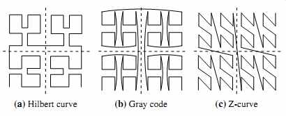
FIG. 11 Some frequently used 2-D space-filling curves.
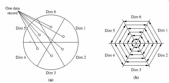
FIG. 12 The circle segment technique. (a) Representing a data record in
circle segments. (b) Laying out pixels in circle segments.
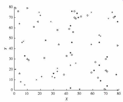
FIG. 13 Visualization of a 2-D data set using a scatter plot.
3.2 Geometric Projection Visualization Techniques
A drawback of pixel-oriented visualization techniques is that they cannot help us much in understanding the distribution of data in a multidimensional space. For example, they do not show whether there is a dense area in a multidimensional subspace. Geometric projection techniques help users find interesting projections of multidimensional data sets. The central challenge the geometric projection techniques try to address is how to visualize a high-dimensional space on a 2-D display.
A scatter plot displays 2-D data points using Cartesian coordinates. A third dimension can be added using different colors or shapes to represent different data points.
FIG. 13 shows an example, where X and Y are two spatial attributes and the third dimension is represented by different shapes. Through this visualization, we can see that points of types "+" and "_" tend to be co-located.
A 3-D scatter plot uses three axes in a Cartesian coordinate system. If it also uses color, it can display up to 4-D data points (FIG. 14).
For data sets with more than four dimensions, scatter plots are usually ineffective.
The scatter-plot matrix technique is a useful extension to the scatter plot. For an n dimensional data set, a scatter-plot matrix is an n_n grid of 2-D scatter plots that provides a visualization of each dimension with every other dimension. FIG. 15 shows an example, which visualizes the Iris data set. The data set consists of 450 samples from each of three species of Iris flowers. There are five dimensions in the data set: length and width of sepal and petal, and species.
The scatter-plot matrix becomes less effective as the dimensionality increases.
Another popular technique, called parallel coordinates, can handle higher dimensionality. To visualize n-dimensional data points, the parallel coordinates technique draws n equally spaced axes, one for each dimension, parallel to one of the display axes.
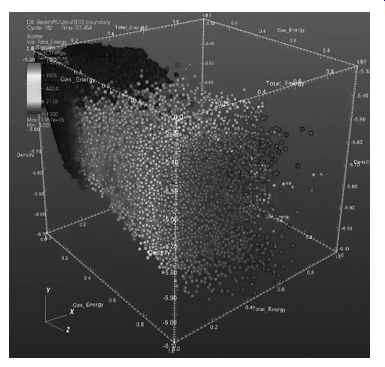
FIG. 14 Visualization of a 3-D data set using a scatter plot.
A data record is represented by a polygonal line that intersects each axis at the point corresponding to the associated dimension value (FIG. 16).
A major limitation of the parallel coordinates technique is that it cannot effectively show a data set of many records. Even for a data set of several thousand records, visual clutter and overlap often reduce the readability of the visualization and make the patterns hard to find.
3.3 Icon-Based Visualization Techniques
Icon-based visualization techniques use small icons to represent multidimensional data values. We look at two popular icon-based techniques: Chernoff faces and stick figures.
Chernoff faces were introduced in 1973 by statistician Herman Chernoff. They display multidimensional data of up to 18 variables (or dimensions) as a cartoon human face (FIG. 17). Chernoff faces help reveal trends in the data. Components of the face, such as the eyes, ears, mouth, and nose, represent values of the dimensions by their shape, size, placement, and orientation. For example, dimensions can be mapped to the following facial characteristics: eye size, eye spacing, nose length, nose width, mouth curvature, mouth width, mouth openness, pupil size, eyebrow slant, eye eccentricity, and head eccentricity.
Chernoff faces make use of the ability of the human mind to recognize small differences in facial characteristics and to assimilate many facial characteristics at once.
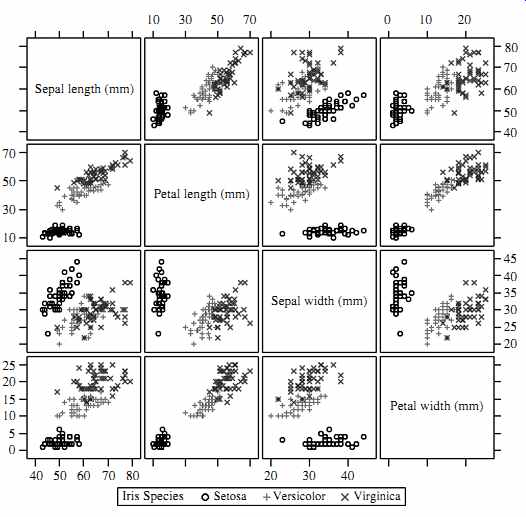
FIG. 15 Visualization of the Iris data set using a scatter-plot matrix.
Viewing large tables of data can be tedious. By condensing the data, Chernoff
faces make the data easier for users to digest. In this way, they facilitate
visualization of regularities and irregularities present in the data, although
their power in relating multiple relationships is limited. Another limitation
is that specific data values are not shown.
Furthermore, facial features vary in perceived importance. This means that the similarity of two faces (representing two multidimensional data points) can vary depending on the order in which dimensions are assigned to facial characteristics. Therefore, this mapping should be carefully chosen. Eye size and eyebrow slant have been found to be important.
Asymmetrical Chernoff faces were proposed as an extension to the original technique.
Since a face has vertical symmetry (along the y-axis), the left and right side of a face are identical, which wastes space. Asymmetrical Chernoff faces double the number of facial characteristics, thus allowing up to 36 dimensions to be displayed.
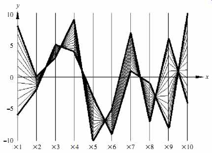
FIG. 16 Here is a visualization that uses parallel coordinates.
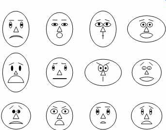
FIG. 17 Chernoff faces. Each face represents an n-dimensional data point
(n _ 18/.
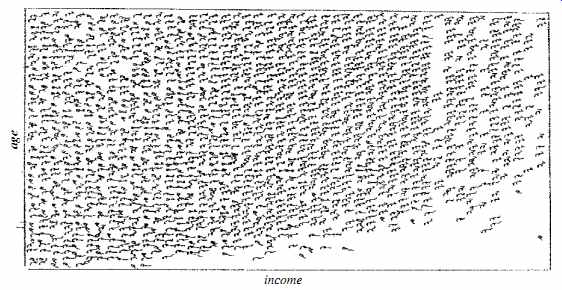
FIG. 18 Census data represented using stick figures. Source: Professor
G. Grinstein, Department of Computer Science, University of Massachusetts at
Lowell.
The stick figure visualization technique maps multidimensional data to five-piece stick figures, where each figure has four limbs and a body. Two dimensions are mapped to the display (x and y) axes and the remaining dimensions are mapped to the angle and/or length of the limbs. FIG. 18 shows census data, where age and income are mapped to the display axes, and the remaining dimensions (gender, education, and so on) are mapped to stick figures. If the data items are relatively dense with respect to the two display dimensions, the resulting visualization shows texture patterns, reflecting data trends.
3.4 Hierarchical Visualization Techniques
The visualization techniques discussed so far focus on visualizing multiple dimensions simultaneously. However, for a large data set of high dimensionality, it would be dif? cult to visualize all dimensions at the same time. Hierarchical visualization techniques partition all dimensions into subsets (i.e., subspaces). The subspaces are visualized in a hierarchical manner.
"Worlds-within-Worlds," also known as n-Vision, is a representative hierarchical visualization method. Suppose we want to visualize a 6-D data set, where the dimensions are F,X1, : : : ,X5.We want to observe how dimension F changes with respect to the other dimensions. We can first fix the values of dimensions X3,X4,X5 to some selected values, say, c3, c4, c5.We can then visualize F, X1, X2 using a 3-D plot, called a world, as shown in FIG. 19. The position of the origin of the inner world is located at the point .c3, c4, c5/ in the outer world, which is another 3-D plot using dimensions X3,X4,X5. A user can interactively change, in the outer world, the location of the origin of the inner world.
The user then views the resulting changes of the inner world. Moreover, a user can vary the dimensions used in the inner world and the outer world. Given more dimensions, more levels of worlds can be used, which is why the method is called "worlds-within worlds." As another example of hierarchical visualization methods, tree-maps display hierarchical data as a set of nested rectangles. For example, FIG. 20 shows a tree-map visualizing Google news stories. All news stories are organized into seven categories, each shown in a large rectangle of a unique color. Within each category (i.e., each rectangle at the top level), the news stories are further partitioned into smaller subcategories.
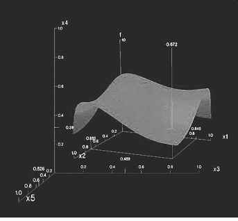
FIG. 19 "Worlds-within-Worlds" (also known as n-Vision).
3.5 Visualizing Complex Data and Relations
In early days, visualization techniques were mainly for numeric data. Recently, more and more non-numeric data, such as text and social networks, have become available.
Visualizing and analyzing such data attracts a lot of interest.
There are many new visualization techniques dedicated to these kinds of data. For example, many people on the Web tag various objects such as pictures, blog entries, and product reviews. A tag cloud is a visualization of statistics of user-generated tags. Often, in a tag cloud, tags are listed alphabetically or in a user-preferred order. The importance of a tag is indicated by font size or color. FIG. 21 shows a tag cloud for visualizing the popular tags used in a Web site.
Tag clouds are often used in two ways. First, in a tag cloud for a single item, we can use the size of a tag to represent the number of times that the tag is applied to this item by different users. Second, when visualizing the tag statistics on multiple items, we can use the size of a tag to represent the number of items that the tag has been applied to, that is, the popularity of the tag.
In addition to complex data, complex relations among data entries also raise challenges for visualization. For example, FIG. 22 uses a disease influence graph to visualize the correlations between diseases. The nodes in the graph are diseases, and the size of each node is proportional to the prevalence of the corresponding disease.
Two nodes are linked by an edge if the corresponding diseases have a strong correlation.
The width of an edge is proportional to the strength of the correlation pattern of the two corresponding diseases.
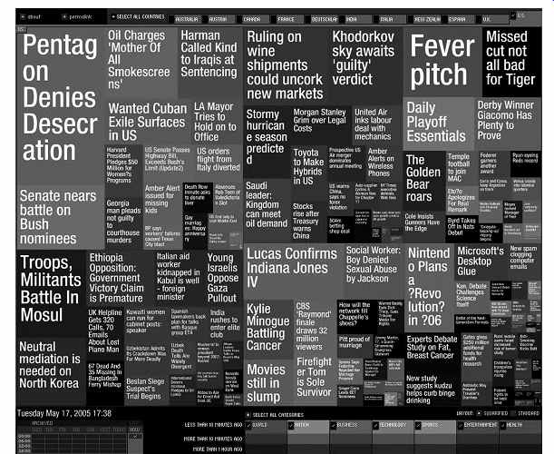
FIG. 20 Newsmap: Use of tree-maps to visualize Google news headline stories.
In summary, visualization provides effective tools to explore data. We have intro duced several popular methods and the essential ideas behind them. There are many existing tools and methods. Moreover, visualization can be used in data mining in vari ous aspects. In addition to visualizing data, visualization can be used to represent the data mining process, the patterns obtained from a mining method, and user interaction with the data. Visual data mining is an important research and development direction.
4. Measuring Data Similarity and Dissimilarity
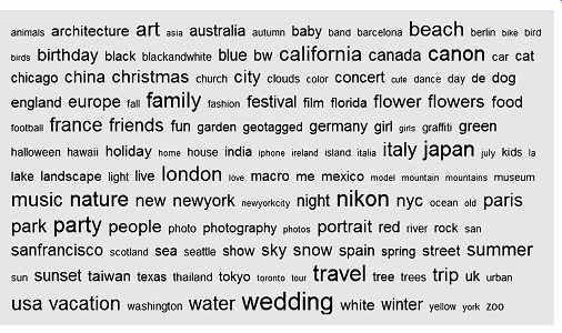
FIG. 21 Using a tag cloud to visualize popular Web site tags.
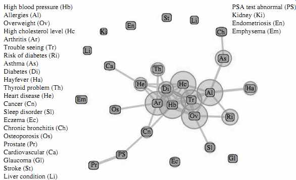
FIG. 22 Disease influence graph of people at least 20 years old in the
NHANES data set.
In data mining applications, such as clustering, outlier analysis, and nearest-neighbor classification, we need ways to assess how alike or unalike objects are in comparison to one another. For example, a store may want to search for clusters of customer objects, resulting in groups of customers with similar characteristics (e.g., similar income, area of residence, and age). Such information can then be used for marketing. A cluster is a collection of data objects such that the objects within a cluster are similar to one another and dissimilar to the objects in other clusters. Outlier analysis also employs clustering-based techniques to identify potential outliers as objects that are highly dis similar to others. Knowledge of object similarities can also be used in nearest-neighbor classification schemes where a given object (e.g., a patient) is assigned a class label (relating to, say, a diagnosis) based on its similarity toward other objects in the model.
This section presents similarity and dissimilarity measures, which are referred to as measures of proximity. Similarity and dissimilarity are related. A similarity measure for two objects, i and j, will typically return the value 0 if the objects are unalike. The higher the similarity value, the greater the similarity between objects. (Typically, a value of 1 indicates complete similarity, that is, the objects are identical.) A dissimilarity measure works the opposite way. It returns a value of 0 if the objects are the same (and therefore, far from being dissimilar). The higher the dissimilarity value, the more dissimilar the two objects are.
In Section 4.1 we present two data structures that are commonly used in the above types of applications: the data matrix (used to store the data objects) and the dissimilarity matrix (used to store dissimilarity values for pairs of objects). We also switch to a different notation for data objects than previously used in this section since now we are dealing with objects described by more than one attribute. We then discuss how object dissimilarity can be computed for objects described by nominal attributes (Section 4.2), by binary attributes (Section 4.3), by numeric attributes (Section 4.4), by ordinal attributes (Section 4.5), or by combinations of these attribute types (Section 4.6). Section 4.7 provides similarity measures for very long and sparse data vectors, such as term-frequency vectors representing documents in information retrieval. Knowing how to compute dissimilarity is useful in studying attributes and will also be referenced in later topics on clustering (Sections 10 and 11), outlier analysis (Section 12), and nearest-neighbor classification (Section 9).
4.1 Data Matrix versus Dissimilarity Matrix
In Section 2, we looked at ways of studying the central tendency, dispersion, and spread of observed values for some attribute X. Our objects there were one-dimensional, that is, described by a single attribute. In this section, we talk about objects described by multiple attributes. Therefore, we need a change in notation. Suppose that we have n objects (e.g., persons, items, or courses) described by p attributes (also called measurements or features, such as age, height, weight, or gender). The objects are x1 D .x11,x12, : : : ,x1p/, x2 D .x21,x22, : : : ,x2p/, and so on, where xij is the value for object xi of the jth attribute.
For brevity, we hereafter refer to object xi as object i. The objects may be tuples in a relational database, and are also referred to as data samples or feature vectors.
Main memory-based clustering and nearest-neighbor algorithms typically operate on either of the following two data structures:
Data matrix (or object-by-attribute structure): This structure stores the n data objects in the form of a relational table, or n-by-p matrix (n objects _p attributes):
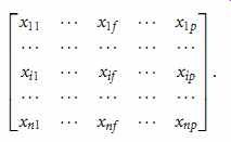
(eqn. 8)
Each row corresponds to an object. As part of our notation, we may use f to index through the p attributes.
Dissimilaritymatrix (or object-by-object structure): This structure stores a collection of proximities that are available for all pairs of n objects. It is often represented by an n-by-n table:
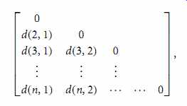
(eqn. 9)
…where d.i, j/ is the measured dissimilarity or "difference" between objects i and j. In general, d.i, j/ is a non-negative number that is close to 0 when objects i and j are highly similar or "near" each other, and becomes larger the more they differ. Note that d.i, i/ D 0; that is, the difference between an object and itself is 0. Furthermore, d.i, j/ D d. j, i/. (For readability, we do not show the d. j, i/ entries; the matrix is symmetric.) Measures of dissimilarity are discussed throughout the remainder of this section.
Measures of similarity can often be expressed as a function of measures of dissimilarity.
For example, for nominal data, sim.i, j/ D 1 d.i, j/,

(eqn. 10)
where sim.i, j/ is the similarity between objects i and j. Throughout the rest of this section, we will also comment on measures of similarity.
A data matrix is made up of two entities or "things," namely rows (for objects) and columns (for attributes). Therefore, the data matrix is often called a two-mode matrix. The dissimilarity matrix contains one kind of entity (dissimilarities) and so is called a one-mode matrix. Many clustering and nearest-neighbor algorithms operate on a dissimilarity matrix. Data in the form of a data matrix can be transformed into a dissimilarity matrix before applying such algorithms.
4.2 Proximity Measures for Nominal Attributes
A nominal attribute can take on two or more states (Section 1.2). For example, map color is a nominal attribute that may have, say, five states: red, yellow, green, pink, and blue.
Let the number of states of a nominal attribute be M. The states can be denoted by letters, symbols, or a set of integers, such as 1, 2, : : : , M. Notice that such integers are used just for data handling and do not represent any specific ordering.
"How is dissimilarity computed between objects described by nominal attributes?" The dissimilarity between two objects i and j can be computed based on the ratio of mismatches:

(eqn. 11)
where m is the number of matches (i.e., the number of attributes for which i and j are in the same state), and p is the total number of attributes describing the objects. Weights can be assigned to increase the effect of m or to assign greater weight to the matches in attributes having a larger number of states.
Example 17: Dissimilarity between nominal attributes. Suppose that we have the sample data of Table 2, except that only the object-identifier and the attribute test-1 are available, where test-1 is nominal. (We will use test-2 and test-3 in later examples.) Let's compute the dissimilarity matrix (Eq. 2.9), that is,
Since here we have one nominal attribute, test-1, we set p D 1 in Eq. (eqn. 11) so that d.i, j/ evaluates to 0 if objects i and j match, and 1 if the objects differ. Thus, we get
From this, we see that all objects are dissimilar except objects 1 and 4 (i.e., d.4,1/ D 0/.
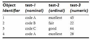
Table 2: A Sample Data Table Containing Attributes of Mixed Type
Alternatively, similarity can be computed as sim.i, j/ D 1 d.i, j/ D m p. (eqn. 12)

Proximity between objects described by nominal attributes can be computed using an alternative encoding scheme. Nominal attributes can be encoded using asymmetric binary attributes by creating a new binary attribute for each of the M states. For an object with a given state value, the binary attribute representing that state is set to 1, while the remaining binary attributes are set to 0. For example, to encode the nominal attribute map color, a binary attribute can be created for each of the five colors previously listed. For an object having the color yellow, the yellow attribute is set to 1, while the remaining four attributes are set to 0. Proximity measures for this form of encoding can be calculated using the methods discussed in the next subsection.
4.3 Proximity Measures for Binary Attributes
Let's look at dissimilarity and similarity measures for objects described by either symmetric or asymmetric binary attributes.
Recall that a binary attribute has only one of two states: 0 and 1, where 0 means that the attribute is absent, and 1 means that it is present (Section 1.3). Given the attribute smoker describing a patient, for instance, 1 indicates that the patient smokes, while 0 indicates that the patient does not. Treating binary attributes as if they are numeric can be misleading. Therefore, methods specific to binary data are necessary for computing dissimilarity.
"So, how can we compute the dissimilarity between two binary attributes?" One approach involves computing a dissimilarity matrix from the given binary data. If all binary attributes are thought of as having the same weight, we have the 2x2 contingency table of Table 3, where q is the number of attributes that equal 1 for both objects i and j, r is the number of attributes that equal 1 for object i but equal 0 for object j, s is the number of attributes that equal 0 for object i but equal 1 for object j, and t is the number of attributes that equal 0 for both objects i and j. The total number of attributes is p, where p = qCr Cs Ct .

Table 3 Contingency Table for Binary Attributes
Recall that for symmetric binary attributes, each state is equally valuable. Dis similarity that is based on symmetric binary attributes is called symmetric binary dissimilarity. If objects i and j are described by symmetric binary attributes, then the dissimilarity between i and j is

(eqn. 13)
For asymmetric binary attributes, the two states are not equally important, such as the positive (1) and negative (0) outcomes of a disease test. Given two asymmetric binary attributes, the agreement of two 1s (a positive match) is then considered more significant than that of two 0s (a negative match). Therefore, such binary attributes are often considered "monary" (having one state). The dissimilarity based on these attributes is called asymmetric binary dissimilarity, where the number of negative matches, t , is considered unimportant and is thus ignored in the following computation:

(eqn. 14)
Complementarily, we can measure the difference between two binary attributes based on the notion of similarity instead of dissimilarity. For example, the asymmetric binary similarity between the objects i and j can be computed as

(eqn. 15)
The coefficient sim.i, j/ of Eq. (eqn. 15) is called the Jaccard coefficient and is popularly referenced in the literature.
When both symmetric and asymmetric binary attributes occur in the same data set, the mixed attributes approach described in Section 4.6 can be applied.
Example 18: Dissimilarity between binary attributes. Suppose that a patient record table (Table 4) contains the attributes name, gender, fever, cough, test-1, test-2, test-3, and test-4, where name is an object identifier, gender is a symmetric attribute, and the remaining attributes are asymmetric binary.

Table 4 Relational Table Where Patients Are Described by Binary Attributes
For asymmetric attribute values, let the values Y (yes) and P (positive) be set to 1, and the value N (no or negative) be set to 0. Suppose that the distance between objects (patients) is computed based only on the asymmetric attributes. According to Eq. (eqn. 14), the distance between each pair of the three patients-Jack, Mary, and Jim-is
These measurements suggest that Jim and Mary are unlikely to have a similar disease because they have the highest dissimilarity value among the three pairs. Of the three patients, Jack and Mary are the most likely to have a similar disease.
4.4 Dissimilarity of Numeric Data: Minkowski Distance
In this section, we describe distance measures that are commonly used for computing the dissimilarity of objects described by numeric attributes. These measures include the Euclidean, Manhattan, and Minkowski distances.
In some cases, the data are normalized before applying distance calculations. This involves transforming the data to fall within a smaller or common range, such as [ 1,1] or [0.0, 1.0]. Consider a height attribute, for example, which could be measured in either meters or inches. In general, expressing an attribute in smaller units will lead to a larger range for that attribute, and thus tend to give such attributes greater effect or "weight." Normalizing the data attempts to give all attributes an equal weight. It may or may not be useful in a particular application. Methods for normalizing data are discussed in detail in Section 3 on data preprocessing.
The most popular distance measure is Euclidean distance (i.e., straight line or "as the crow ?ies"). Let i D .xi1, xi2, : : : , xip/ and j D .xj1, xj2, : : : , xjp/ be two objects described by p numeric attributes. The Euclidean distance between objects i and j is defined as

(eqn. 16)
Another well-known measure is the Manhattan (or city block) distance, named so because it is the distance in blocks between any two points in a city (such as 2 blocks down and 3 blocks over for a total of 5 blocks). It is defined as

(eqn. 17)
Both the Euclidean and the Manhattan distance satisfy the following mathematical properties:
Non-negativity: d.i, j/ _ 0: Distance is a non-negative number.
Identity of indiscernibles: d.i, i/ D 0: The distance of an object to itself is 0.
Symmetry: d.i, j/ D d. j, i/: Distance is a symmetric function.
Triangle inequality: d.i, j/ _ d.i, k/Cd.k, j/: Going directly from object i to object j in space is no more than making a detour over any other object k.
A measure that satis?es these conditions is known as metric. Please note that the non-negativity property is implied by the other three properties.
[...]
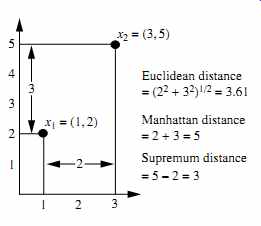
FIG. 23 Euclidean, Manhattan, and supremum distances between two objects.
4.5 Proximity Measures for Ordinal Attributes
The values of an ordinal attribute have a meaningful order or ranking about them, yet the magnitude between successive values is unknown (Section 1.4). An exam ple includes the sequence small, medium, large for a size attribute. Ordinal attributes may also be obtained from the discretization of numeric attributes by splitting the value range into a finite number of categories. These categories are organized into ranks. That is, the range of a numeric attribute can be mapped to an ordinal attribute f having Mf states. For example, the range of the interval-scaled attribute temperature (in Celsius) can be organized into the following states: 30 to 10, 10 to 10, 10 to 30, representing the categories cold temperature, moderate temperature, and warm temperature, respectively. Let M represent the number of possible states that an ordinal attribute can have. These ordered states define the ranking 1, : : : , Mf .
"How are ordinal attributes handled?" The treatment of ordinal attributes is quite similar to that of numeric attributes when computing dissimilarity between objects. Suppose that f is an attribute from a set of ordinal attributes describing n objects. The dissimilarity computation with respect to f involves the following steps:
1. The value of f for the ith object is xif , and f has Mf ordered states, representing the ranking 1, : : : , Mf . Replace each xif by its corresponding rank, rif 2 f1, : : : , Mf g.
2. Since each ordinal attribute can have a different number of states, it is often necessary to map the range of each attribute onto [0.0, 1.0] so that each attribute has equal weight. We perform such data normalization by replacing the rank rif of the ith object in the f th attribute by

(eqn. 21)
3. Dissimilarity can then be computed using any of the distance measures described in Section 4.4 for numeric attributes, using zif to represent the f value for the ith object.
Example 21 Dissimilarity between ordinal attributes. Suppose that we have the sample data shown earlier in Table 2, except that this time only the object-identifier and the continuous ordinal attribute, test-2, are available. There are three states for test-2: fair, good, and excellent, that is, Mf D 3. For step 1, if we replace each value for test-2 by its rank, the four objects are assigned the ranks 3, 1, 2, and 3, respectively. Step 2 normalizes the ranking by mapping rank 1 to 0.0, rank 2 to 0.5, and rank 3 to 1.0. For step 3, we can use, say, the Euclidean distance (Eq. 2.16), which results in the following dissimilarity matrix:
Therefore, objects 1 and 2 are the most dissimilar, as are objects 2 and 4 (i.e., d.2,1/ D 1.0 and d.4,2/ D 1.0). This makes intuitive sense since objects 1 and 4 are both excellent.
Object 2 is fair, which is at the opposite end of the range of values for test-2.
Similarity values for ordinal attributes can be interpreted from dissimilarity as sim.i, j/ D 1 d.i, j/.
4.6 Dissimilarity for Attributes of Mixed Types
Sections 4.2 through 4.5 discussed how to compute the dissimilarity between objects described by attributes of the same type, where these types may be either nominal, sym metric binary, asymmetric binary, numeric, or ordinal. However, in many real databases, objects are described by a mixture of attribute types. In general, a database can contain all of these attribute types.
"So, how can we compute the dissimilarity between objects of mixed attribute types?" One approach is to group each type of attribute together, performing separate data mining (e.g., clustering) analysis for each type. This is feasible if these analyses derive compatible results. However, in real applications, it is unlikely that a separate analysis per attribute type will generate compatible results.
A more preferable approach is to process all attribute types together, performing a single analysis. One such technique combines the different attributes into a single dis similarity matrix, bringing all of the meaningful attributes onto a common scale of the interval [0.0, 1.0].
Suppose that the data set contains p attributes of mixed type. The dissimilarity d.i, j/ between objects i and j is defined as

(eqn. 22)
Table 5 Document Vector or Term-Frequency Vector
4.7 Cosine Similarity
A document can be represented by thousands of attributes, each recording the frequency of a particular word (such as a keyword) or phrase in the document. Thus, each document is an object represented by what is called a term-frequency vector. For example, in Table 5, we see that Document 1 contains five instances of the word team, while hockey occurs three times. The word coach is absent from the entire document, as indicated by a count value of 0. Such data can be highly asymmetric.
Term-frequency vectors are typically very long and sparse (i.e., they have many 0 values). Applications using such structures include information retrieval, text document clustering, biological taxonomy, and gene feature mapping. The traditional distance measures that we have studied in this section do not work well for such sparse numeric data. For example, two term-frequency vectors may have many 0 values in common, meaning that the corresponding documents do not share many words, but this does not make them similar. We need a measure that will focus on the words that the two documents do have in common, and the occurrence frequency of such words. In other words, we need a measure for numeric data that ignores zero-matches.
Cosine similarity is a measure of similarity that can be used to compare documents or, say, give a ranking of documents with respect to a given vector of query words. Let x and y be two vectors for comparison. Using the cosine measure as a
[...]
5. Summary
Data sets are made up of data objects. A data object represents an entity. Data objects are described by attributes. Attributes can be nominal, binary, ordinal, or numeric.
The values of a nominal (or categorical) attribute are symbols or names of things, where each value represents some kind of category, code, or state.
Binary attributes are nominal attributes with only two possible states (such as 1 and 0 or true and false). If the two states are equally important, the attribute is symmetric; otherwise it is asymmetric.
An ordinal attribute is an attribute with possible values that have a meaningful order or ranking among them, but the magnitude between successive values is not known.
A numeric attribute is quantitative (i.e., it is a measurable quantity) represented in integer or real values. Numeric attribute types can be interval-scaled or ratio scaled. The values of an interval-scaled attribute are measured in fixed and equal units. Ratio-scaled attributes are numeric attributes with an inherent zero-point.
Measurements are ratio-scaled in that we can speak of values as being an order of magnitude larger than the unit of measurement.
Basic statistical descriptions provide the analytical foundation for data preprocessing. The basic statistical measures for data summarization include mean, weighted mean, median, and mode for measuring the central tendency of data; and range, quantiles, quartiles, interquartile range, variance, and standard deviation for measuring the dispersion of data. Graphical representations (e.g., boxplots, quantile plots, quantile- quantile plots, histograms, and scatter plots) facilitate visual inspection of the data and are thus useful for data preprocessing and mining.
Data visualization techniques may be pixel-oriented, geometric-based, icon-based, or hierarchical. These methods apply to multidimensional relational data. Additional techniques have been proposed for the visualization of complex data, such as text and social networks.
Measures of object similarity and dissimilarity are used in data mining applications such as clustering, outlier analysis, and nearest-neighbor classification. Such measures of proximity can be computed for each attribute type studied in this section, or for combinations of such attributes. Examples include the Jaccard coefficient for asymmetric binary attributes and Euclidean, Manhattan, Minkowski, and supremum distances for numeric attributes. For applications involving sparse numeric data vectors, such as term-frequency vectors, the cosine measure and the Tanimoto coefficient are often used in the assessment of similarity.
6. Exercises
1. Give three additional commonly used statistical measures that are not already illustrated in this section for the characterization of data dispersion. Discuss how they can be computed efficiently in large databases.
2. Suppose that the data for analysis includes the attribute age. The age values for the data tuples are (in increasing order) 13, 15, 16, 16, 19, 20, 20, 21, 22, 22, 25, 25, 25, 25, 30, 33, 33, 35, 35, 35, 35, 36, 40, 45, 46, 52, 70.
(a) What is the mean of the data? What is the median? (b) What is the mode of the data? Comment on the data's modality (i.e., bimodal, trimodal, etc.).
(c) What is the midrange of the data? (d) Can you find (roughly) the first quartile (Q1) and the third quartile (Q3) of the data? (e) Give the five-number summary of the data.
(f) Show a boxplot of the data.
(g) How is a quantile-quantile plot different from a quantile plot ?
3. Suppose that the values for a given set of data are grouped into intervals. The intervals and corresponding frequencies are as follows:
Compute an approximate median value for the data.
4. Suppose that a hospital tested the age and body fat data for 18 randomly selected adults with the following results:
(a) Calculate the mean, median, and standard deviation of age and %fat.
(b) Draw the boxplots for age and %fat.
(c) Draw a scatter plot and a q-q plot based on these two variables.
5. Briefly outline how to compute the dissimilarity between objects described by the following:
(a) Nominal attributes (b) Asymmetric binary attributes
(c) Numeric attributes (d) Term-frequency vectors
6. Given two objects represented by the tuples (22, 1, 42, 10) and (20, 0, 36, 8):
(a) Compute the Euclidean distance between the two objects.
(b) Compute the Manhattan distance between the two objects.
(c) Compute the Minkowski distance between the two objects, using q D 3.
(d) Compute the supremum distance between the two objects.
7. The median is one of the most important holistic measures in data analysis. Pro pose several methods for median approximation. Analyze their respective complexity under different parameter settings and decide to what extent the real value can be approximated. Moreover, suggest a heuristic strategy to balance between accuracy and complexity and then apply it to all methods you have given.
8. It is important to define or select similarity measures in data analysis. However, there is no commonly accepted subjective similarity measure. Results can vary depending on the similarity measures used. Nonetheless, seemingly different similarity measures may be equivalent after some transformation; statistics-based visualization of data using boxplots, quantile plots, quantile-quantile plots, scatter plots, and loess curves, see Cleveland [Cle93].
Pioneering work on data visualization techniques is described in The Visual Display of Quantitative Information [Tuf83], Envisioning Information [Tuf90], and Visual Explanations: Images and Quantities, Evidence and Narrative [Tuf97], all by Tufte, in addition to Graphics and Graphic Information Processing by Bertin [Ber81], Visualizing Data by Cleveland [Cle93], and Information Visualization in DataMining and Knowledge Discovery edited by Fayyad, Grinstein, and Wierse [FGW01].
Major conferences and symposiums on visualization include ACM Human Factors in Computing Systems (CHI), Visualization, and the International Symposium on Information Visualization. Research on visualization is also published in Transactions on Visualization and Computer Graphics, Journal of Computational and Graphical Statistics, and IEEE Computer Graphics and Applications.
Many graphical user interfaces and visualization tools have been developed and can be found in various data mining products. Several books on data mining (e.g., Data Mining Solutions by Westphal and Blaxton [WB98]) present many good examples and visual snapshots. For a survey of visualization techniques, see "Visual techniques for exploring databases" by Keim [Kei97].
Similarity and distance measures among various variables have been introduced in many textbooks that study cluster analysis, including Hartigan [Har75]; Jain and Dubes [JD88]; Kaufman and Rousseeuw [KR90]; and Arabie, Hubert, and de Soete [AHS96].
Methods for combining attributes of different types into a single dissimilarity matrix were introduced by Kaufman and Rousseeuw [KR90].
Suppose we have the following 2-D data set:
(a) Consider the data as 2-D data points. Given a new data point, x = .1.4,1.6/ as a query, rank the database points based on similarity with the query using Euclidean distance, Manhattan distance, supremum distance, and cosine similarity.
(b) Normalize the data set to make the norm of each data point equal to 1. Use Euclidean distance on the transformed data to rank the data points.