AMAZON multi-meters discounts AMAZON oscilloscope discounts
It's tempting to jump straight into mining, but first, we need to get the data ready. This involves having a closer look at attributes and data values. Real-world data are typically noisy, enormous in volume (often several gigabytes or more), and may originate from a hodgepodge of heterogeneous sources. This section is about getting familiar with your data.
Knowledge about your data is useful for data preprocessing (see Section 3), the first major task of the data mining process. You will want to know the following: What are the types of attributes or fields that make up your data? What kind of values does each attribute have? Which attributes are discrete, and which are continuous-valued? What do the data look like? How are the values distributed? Are there ways we can visualize the data to get a better sense of it all? Can we spot any outliers? Can we measure the similarity of some data objects with respect to others? Gaining such insight into the data will help with the subsequent analysis.
"So what can we learn about our data that's helpful in data preprocessing?" We begin in Section 1 by studying the various attribute types. These include nominal attributes, binary attributes, ordinal attributes, and numeric attributes. Basic statistical descriptions can be used to learn more about each attribute's values, as described in Section 2.
Given a temperature attribute, for example, we can determine its mean (average value), median (middle value), and mode (most common value). These are measures of central tendency, which give us an idea of the "middle" or center of distribution.
Knowing such basic statistics regarding each attribute makes it easier to fill in missing values, smooth noisy values, and spot outliers during data preprocessing. Knowledge of the attributes and attribute values can also help in fixing inconsistencies incurred during data integration. Plotting the measures of central tendency shows us if the data are symmetric or skewed. Quintile plots, histograms, and scatter plots are other graphic displays of basic statistical descriptions. These can all be useful during data preprocessing and can provide insight into areas for mining.
The field of data visualization provides many additional techniques for viewing data through graphical means. These can help identify relations, trends, and biases "hidden" in unstructured data sets. Techniques may be as simple as scatter-plot matrices (where two attributes are mapped onto a 2-D grid) to more sophisticated methods such as tree maps (where a hierarchical partitioning of the screen is displayed based on the attribute values). Data visualization techniques are described in Section 3.
Finally, we may want to examine how similar (or dissimilar) data objects are. For example, suppose we have a database where the data objects are patients, described by their symptoms. We may want to find the similarity or dissimilarity between individual patients. Such information can allow us to find clusters of like patients within the data set. The similarity/dissimilarity between objects may also be used to detect outliers in the data, or to perform nearest-neighbor classification. (Clustering is the topic of Sections 10 and 11, while nearest-neighbor classification is discussed in Section 9.) There are many measures for assessing similarity and dissimilarity. In general, such measures are referred to as proximity measures. Think of the proximity of two objects as a function of the distance between their attribute values, although proximity can also be calculated based on probabilities rather than actual distance. Measures of data proximity are described in Section 4.
In summary, by the end of this section, you will know the different attribute types and basic statistical measures to describe the central tendency and dispersion (spread) of attribute data. You will also know techniques to visualize attribute distributions and how to compute the similarity or dissimilarity between objects.
1. Data Objects and Attribute Types
Data sets are made up of data objects. A data object represents an entity-in a sales database, the objects may be customers, store items, and sales; in a medical database, the objects may be patients; in a university database, the objects may be students, professors, and courses. Data objects are typically described by attributes. Data objects can also be referred to as samples, examples, instances, data points, or objects. If the data objects are stored in a database, they are data tuples. That is, the rows of a database correspond to the data objects, and the columns correspond to the attributes. In this section, we define attributes and look at the various attribute types.
1.1 What Is an Attribute?
An attribute is a data field, representing a characteristic or feature of a data object. The nouns attribute, dimension, feature, and variable are often used interchangeably in the literature. The term dimension is commonly used in data warehousing. Machine learning literature tends to use the term feature, while statisticians prefer the term variable. Data mining and database professionals commonly use the term attribute, and we do here as well. Attributes describing a customer object can include, for example, customer ID, name, and address. Observed values for a given attribute are known as observations. A set of attributes used to describe a given object is called an attribute vector (or feature vector). The distribution of data involving one attribute (or variable) is called univariate.
A bivariate distribution involves two attributes, and so on.
The type of an attribute is determined by the set of possible values-nominal, binary, ordinal, or numeric-the attribute can have. In the following subsections, we introduce each type.
1.2 Nominal Attributes
Nominal means "relating to names." The values of a nominal attribute are symbols or names of things. Each value represents some kind of category, code, or state, and so nominal attributes are also referred to as categorical. The values do not have any meaningful order. In computer science, the values are also known as enumerations.
Example 1: Nominal attributes. Suppose that hair color and marital status are two attributes describing person objects. In our application, possible values for hair color are black, brown, blond, red, auburn, gray, and white. The attribute marital status can take on the values single, married, divorced, and widowed. Both hair color and marital status are nominal attributes. Another example of a nominal attribute is occupation, with the values teacher, dentist, programmer, farmer, and so on.
Although we said that the values of a nominal attribute are symbols or "names of things," it is possible to represent such symbols or "names" with numbers. With hair color, for instance, we can assign a code of 0 for black, 1 for brown, and so on.
Another example is custom or ID, with possible values that are all numeric. However, in such cases, the numbers are not intended to be used quantitatively. That is, mathematical operations on values of nominal attributes are not meaningful. It makes no sense to subtract one customer ID number from another, unlike, say, subtracting an age value from another (where age is a numeric attribute). Even though a nominal attribute may have integers as values, it is not considered a numeric attribute because the integers are not meant to be used quantitatively. We will say more on numeric attributes in Section 1.5.
Because nominal attribute values do not have any meaningful order about them and are not quantitative, it makes no sense to find the mean (average) value or median (middle) value for such an attribute, given a set of objects. One thing that is of interest, however, is the attribute's most commonly occurring value. This value, known as the mode, is one of the measures of central tendency. You will learn about measures of central tendency in Section 2.
1.3 Binary Attributes
A binary attribute is a nominal attribute with only two categories or states: 0 or 1, where 0 typically means that the attribute is absent, and 1 means that it is present. Binary attributes are referred to as Boolean if the two states correspond to true and false.
Example 2: Binary attributes. Given the attribute smoker describing a patient object, 1 indicates that the patient smokes, while 0 indicates that the patient does not. Similarly, suppose the patient undergoes a medical test that has two possible outcomes. The attribute medical test is binary, where a value of 1 means the result of the test for the patient is positive, while 0 means the result is negative.
A binary attribute is symmetric if both of its states are equally valuable and carry the same weight; that is, there is no preference on which outcome should be coded as 0 or 1. One such example could be the attribute gender having the states male and female.
A binary attribute is asymmetric if the outcomes of the states are not equally important, such as the positive and negative outcomes of a medical test for HIV. By convention, we code the most important outcome, which is usually the rarest one, by 1 (e.g., HIV positive) and the other by 0 (e.g., HIV negative).
1.4 Ordinal Attributes
An ordinal attribute is an attribute with possible values that have a meaningful order or ranking among them, but the magnitude between successive values is not known.
Example 3: Ordinal attributes. Suppose that drink size corresponds to the size of drinks available at a fast-food restaurant. This nominal attribute has three possible values: small, medium, and large. The values have a meaningful sequence (which corresponds to increasing drink size); however, we cannot tell from the values how much bigger, say, a medium is than a large. Other examples of ordinal attributes include grade (e.g., AC, A, A , BC, and so on) and professional rank. Professional ranks can be enumerated in a sequential order: for example, assistant, associate, and full for professors, and private, private first class, specialist, corporal, and sergeant for army ranks.
Ordinal attributes are useful for registering subjective assessments of qualities that cannot be measured objectively; thus ordinal attributes are often used in surveys for ratings. In one survey, participants were asked to rate how satisfied they were as customers. Customer satisfaction had the following ordinal categories: 0: very dissatisfied, 1: somewhat dissatisfied, 2: neutral, 3: satisfied, and 4: very satisfied.
Ordinal attributes may also be obtained from the discretization of numeric quantities by splitting the value range into a finite number of ordered categories as described in Section 3 on data reduction.
The central tendency of an ordinal attribute can be represented by its mode and its median (the middle value in an ordered sequence), but the mean cannot be defined.
Note that nominal, binary, and ordinal attributes are qualitative. That is, they describe a feature of an object without giving an actual size or quantity. The values of such qualitative attributes are typically words representing categories. If integers are used, they represent computer codes for the categories, as opposed to measurable quantities (e.g., 0 for small drink size, 1 for medium, and 2 for large). In the following subsection we look at numeric attributes, which provide quantitative measurements of an object.
1.5 Numeric Attributes
A numeric attribute is quantitative; that is, it is a measurable quantity, represented in integer or real values. Numeric attributes can be interval-scaled or ratio-scaled.
Interval-Scaled Attributes: Interval-scaled attributes are measured on a scale of equal-size units. The values of interval-scaled attributes have order and can be positive, 0, or negative. Thus, in addition to providing a ranking of values, such attributes allow us to compare and quantify the difference between values.
Example 4: Interval-scaled attributes. A temperature attribute is interval-scaled. Suppose that we have the outdoor temperature value for a number of different days, where each day is an object. By ordering the values, we obtain a ranking of the objects with respect to temperature. In addition, we can quantify the difference between values. For example, a temperature of 20 degr. C is five degrees higher than a temperature of 15 degr. C. Calendar dates are another example. For instance, the years 2002 and 2010 are eight years apart.
Temperatures in Celsius and Fahrenheit do not have a true zero-point, that is, neither 0 degr. C nor 0 degr. F indicates "no temperature." (On the Celsius scale, for example, the unit of measurement is 1/100 of the difference between the melting temperature and the boiling temperature of water in atmospheric pressure.) Although we can compute the difference between temperature values, we cannot talk of one temperature value as being a multiple of another. Without a true zero, we cannot say, for instance, that 10 degr. C is twice as warm as 5 degr. C. That is, we cannot speak of the values in terms of ratios. Similarly, there is no true zero-point for calendar dates. (The year 0 does not correspond to the beginning of time.) This brings us to ratio-scaled attributes, for which a true zero-point exits.
Because interval-scaled attributes are numeric, we can compute their mean value, in addition to the median and mode measures of central tendency.
Ratio-Scaled Attributes
A ratio-scaled attribute is a numeric attribute with an inherent zero-point. That is, if a measurement is ratio-scaled, we can speak of a value as being a multiple (or ratio) of another value. In addition, the values are ordered, and we can also compute the difference between values, as well as the mean, median, and mode.
Example 5: Ratio-scaled attributes. Unlike temperatures in Celsius and Fahrenheit, the Kelvin (K) temperature scale has what is considered a true zero-point (0 degr. K D 273.15 degr. C): It is the point at which the particles that comprise matter have zero kinetic energy. Other examples of ratio-scaled attributes include count attributes such as years of experience (e.g., the objects are employees) and number of words (e.g., the objects are documents).
Additional examples include attributes to measure weight, height, latitude and longitude coordinates (e.g., when clustering houses), and monetary quantities (e.g., you are 100 times richer with $100 than with $1).
1.6 Discrete versus Continuous Attributes
In our presentation, we have organized attributes into nominal, binary, ordinal, and numeric types. There are many ways to organize attribute types. The types are not mutually exclusive.
Classification algorithms developed from the field of machine learning often talk of attributes as being either discrete or continuous. Each type may be processed differently.
A discrete attribute has a finite or countably infinite set of values, which may or may not be represented as integers. The attributes hair color, smoker, medical test, and drink size each have a finite number of values, and so are discrete. Note that discrete attributes may have numeric values, such as 0 and 1 for binary attributes or, the values 0 to 110 for the attribute age. An attribute is countably infinite if the set of possible values is infinite but the values can be put in a one-to-one correspondence with natural numbers. For example, the attribute customer ID is countably infinite. The number of customers can grow to infinity, but in reality, the actual set of values is countable (where the values can be put in one-to-one correspondence with the set of integers). Zip codes are another example.
If an attribute is not discrete, it is continuous. The terms numeric attribute and continuous attribute are often used interchangeably in the literature. (This can be confusing because, in the classic sense, continuous values are real numbers, whereas numeric values can be either integers or real numbers.) In practice, real values are represented using a finite number of digits. Continuous attributes are typically represented as floating-point variables.
2. Basic Statistical Descriptions of Data
For data preprocessing to be successful, it is essential to have an overall picture of your data. Basic statistical descriptions can be used to identify properties of the data and highlight which data values should be treated as noise or outliers.
This section discusses three areas of basic statistical descriptions. We start with measures of central tendency (Section 2.1), which measure the location of the middle or center of a data distribution. Intuitively speaking, given an attribute, where do most of its values fall? In particular, we discuss the mean, median, mode, and midrange.
In addition to assessing the central tendency of our data set, we also would like to have an idea of the dispersion of the data. That is, how are the data spread out? The most common data dispersion measures are the range, quartiles, and inter-quartile range; the five-number summary and box-plots; and the variance and standard deviation of the data These measures are useful for identifying outliers and are described in Section 2.2.
Finally, we can use many graphic displays of basic statistical descriptions to visually inspect our data (Section 2.3). Most statistical or graphical data presentation software packages include bar charts, pie charts, and line graphs. Other popular displays of data summaries and distributions include quintile plots, quantile-quantile plots, histograms, and scatter plots.
2.1 Measuring the Central Tendency: Mean, Median, and Mode
In this section, we look at various ways to measure the central tendency of data. Suppose that we have some attribute X, like salary, which has been recorded for a set of objects.
Let x1, x2, : : : , xN be the set of N observed values or observations for X. Here, these values may also be referred to as the data set (for X). If we were to plot the observations for salary, where would most of the values fall? This gives us an idea of the central tendency of the data. Measures of central tendency include the mean, median, mode, and midrange.
The most common and effective numeric measure of the "center" of a set of data is the (arithmetic) mean. Let x1,x2, : : : ,xN be a set of N values or observations, such as for some numeric attribute X, like salary. The mean of this set of values is:
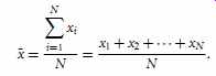
(eqn. 1)
This corresponds to the built-in aggregate function, average (avg() in SQL), provided in relational database systems.
Example 7 Median. Let's find the median of the data from Example 6. The data are already sorted in increasing order. There is an even number of observations (i.e., 12); therefore, the median is not unique. It can be any value within the two middlemost values of 52 and 56 (that is, within the sixth and seventh values in the list). By convention, we assign the average of the two middlemost values as the median; that is, 52C56 2 D 108 2 D 54. Thus, the median is $54,000.
Suppose that we had only the first 11 values in the list. Given an odd number of values, the median is the middlemost value. This is the sixth value in this list, which has a value of $52,000.
The median is expensive to compute when we have a large number of observations.
For numeric attributes, however, we can easily approximate the value. Assume that data are grouped in intervals according to their xi data values and that the frequency (i.e., number of data values) of each interval is known. For example, employees may be grouped according to their annual salary in intervals such as $10-20,000, $20-30,000, and so on. Let the interval that contains the median frequency be the median inter val. We can approximate the median of the entire data set (e.g., the median salary) by interpolation using the formula:
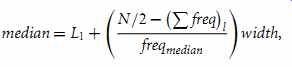
(eqn. 3)
where L1 is the lower boundary of the median interval, N is the number of values in the entire data set,
Pfreq _ l is the sum of the frequencies of all of the intervals that are lower than the median interval, freq-median is the frequency of the median interval, and width is the width of the median interval.
The mode is another measure of central tendency. The mode for a set of data is the value that occurs most frequently in the set. Therefore, it can be determined for qualitative and quantitative attributes. It is possible for the greatest frequency to correspond to several different values, which results in more than one mode. Data sets with one, two, or three modes are respectively called unimodal, bimodal, and trimodal. In general, a data set with two or more modes is multimodal. At the other extreme, if each data value occurs only once, then there is no mode.
Example 8: Mode. The data from Example 6 are bimodal. The two modes are $52,000 and $70,000.
For unimodal numeric data that are moderately skewed (asymmetrical), we have the following empirical relation:
mean mode _ 3_.mean median/. (eqn. 4)
This implies that the mode for unimodal frequency curves that are moderately skewed can easily be approximated if the mean and median values are known.
The midrange can also be used to assess the central tendency of a numeric data set.
It is the average of the largest and smallest values in the set. This measure is easy to compute using the SQL aggregate functions, max() and min().
Example 9: Midrange. The midrange of the data of Example 6 is 30,000 C110,000 2 = $70,000.
In a unimodal frequency curve with perfect symmetric data distribution, the mean, median, and mode are all at the same center value, as shown in Figure 1(a).
Data in most real applications are not symmetric. They may instead be either positively skewed, where the mode occurs at a value that is smaller than the median (FIG. 1b), or negatively skewed, where the mode occurs at a value greater than the median (FIG. 1c).
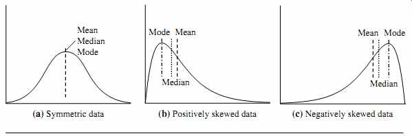
FIG. 1 Mean, median, and mode of symmetric versus positively and negatively
skewed data.
2.2 Measuring the Dispersion of Data: Range, Quartiles, Variance, Standard Deviation, and Interquartile Range
We now look at measures to assess the dispersion or spread of numeric data. The measures include range, quantiles, quartiles, percentiles, and the interquartile range. The five-number summary, which can be displayed as a boxplot, is useful in identifying outliers. Variance and standard deviation also indicate the spread of a data distribution.
Range, Quartiles, and Interquartile Range
To start off, let's study the range, quantiles, quartiles, percentiles, and the interquartile range as measures of data dispersion.
Let x1, x2, : : : , xN be a set of observations for some numeric attribute, X. The range of the set is the difference between the largest (max()) and smallest (min()) values.
Suppose that the data for attribute X are sorted in increasing numeric order. Imagine that we can pick certain data points so as to split the data distribution into equal-size consecutive sets, as in FIG. 2. These data points are called quantiles. Quantiles are points taken at regular intervals of a data distribution, dividing it into essentially equal size consecutive sets. (We say "essentially" because there may not be data values of X that divide the data into exactly equal-sized subsets. For readability, we will refer to them as equal.) The kth q-quantile for a given data distribution is the value x such that at most k=q of the data values are less than x and at most .q k/=q of the data values are more than x, where k is an integer such that 0 < k < q. There are q 1 q-quantiles.
The 2-quantile is the data point dividing the lower and upper halves of the data distribution. It corresponds to the median. The 4-quantiles are the three data points that split the data distribution into four equal parts; each part represents one-fourth of the data distribution. They are more commonly referred to as quartiles. The 100-quantiles are more commonly referred to as percentiles; they divide the data distribution into 100 equal-sized consecutive sets. The median, quartiles, and percentiles are the most widely used forms of quantiles.
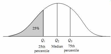
FIG. 2 A plot of the data distribution for some attribute X. The quantiles
plotted are quartiles. The three quartiles divide the distribution into four
equal-size consecutive subsets. The second quartile corresponds to the median.
The quartiles give an indication of a distribution's center, spread, and shape. The first quartile, denoted by Q1, is the 25th percentile. It cuts off the lowest 25% of the data.
The third quartile, denoted by Q3, is the 75th percentile-it cuts off the lowest 75% (or highest 25%) of the data. The second quartile is the 50th percentile. As the median, it gives the center of the data distribution.
The distance between the first and third quartiles is a simple measure of spread that gives the range covered by the middle half of the data. This distance is called the interquartile range (IQR) and is defined as
IQR = Q3 - Q1. (eqn. 5)
Example 10 Interquartile range. The quartiles are the three values that split the sorted data set into four equal parts. The data of Example 6 contain 12 observations, already sorted in increasing order. Thus, the quartiles for this data are the third, sixth, and ninth values, respectively, in the sorted list. Therefore, Q1= $47,000 and Q3 is $63,000. Thus, the interquartile range is IQR= 63 - 47 = $16,000. (Note that the sixth value is a median, $52,000, although this data set has two medians since the number of data values is even.)
Five-Number Summary, Boxplots, and Outliers
No single numeric measure of spread (e.g., IQR) is very useful for describing skewed distributions. Have a look at the symmetric and skewed data distributions of FIG. 1.
In the symmetric distribution, the median (and other measures of central tendency) splits the data into equal-size halves. This does not occur for skewed distributions. Therefore, it is more informative to also provide the two quartiles Q1 and Q3, along with the median. A common rule of thumb for identifying suspected outliers is to single out values falling at least 1.5xIQR above the third quartile or below the first quartile.
Because Q1, the median, and Q3 together contain no information about the end points (e.g., tails) of the data, a fuller summary of the shape of a distribution can be obtained by providing the lowest and highest data values as well. This is known as the five-number summary. The five-number summary of a distribution consists of the median (Q2), the quartiles Q1 and Q3, and the smallest and largest individual observations, written in the order of Minimum, Q1, Median, Q3, Maximum.
Boxplots are a popular way of visualizing a distribution. A boxplot incorporates the five-number summary as follows:
Typically, the ends of the box are at the quartiles so that the box length is the interquartile range.
The median is marked by a line within the box.
Two lines (called whiskers) outside the box extend to the smallest (Minimum) and largest (Maximum) observations.
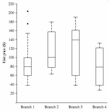
FIG. 3 Boxplot for the unit price data for items sold at four branches
of AllElectronics during a given time period.
When dealing with a moderate number of observations, it is worthwhile to plot potential outliers individually. To do this in a boxplot, the whiskers are extended to the extreme low and high observations only if these values are less than 1.5xIQR beyond the quartiles. Otherwise, the whiskers terminate at the most extreme observations occur ring within 1.5xIQR of the quartiles. The remaining cases are plotted individually.
Boxplots can be used in the comparisons of several sets of compatible data.
Example 11 Boxplot. FIG. 3 shows boxplots for unit price data for items sold at four branches of AllElectronics during a given time period. For branch 1, we see that the median price of items sold is $80, Q1 is $60, and Q3 is $100. Notice that two outlying observations for this branch were plotted individually, as their values of 175 and 202 are more than 1.5 times the IQR here of 40.
Boxplots can be computed in O.nlogn/ time. Approximate boxplots can be computed in linear or sub-linear time depending on the quality guarantee required.
Variance and Standard Deviation
Variance and standard deviation are measures of data dispersion. They indicate how spread out a data distribution is. A low standard deviation means that the data observations tend to be very close to the mean, while a high standard deviation indicates that the data are spread out over a large range of values.
2.3 Graphic Displays of Basic Statistical Descriptions of Data
In this section, we study graphic displays of basic statistical descriptions. These include quantile plots, quantile-quantile plots, histograms, and scatter plots. Such graphs are helpful for the visual inspection of data, which is useful for data preprocessing. The first three of these show univariate distributions (i.e., data for one attribute), while scatter plots show bivariate distributions (i.e., involving two attributes).
Quantile Plot
In this and the following subsections, we cover common graphic displays of data distributions. A quantile plot is a simple and effective way to have a first look at a univariate data distribution. First, it displays all of the data for the given attribute (allowing the user to assess both the overall behavior and unusual occurrences). Second, it plots quantile information (see Section 2.2). Let xi , for i = 1 to N, be the data sorted in increasing order so that x1 is the smallest observation and xN is the largest for some ordinal or numeric attribute X. Each observation, xi , is paired with a percentage, fi , which indicates that approximately fi x100%of the data are below the value, xi .We say "approximately" because there may not be a value with exactly a fraction, fi , of the data below xi . Note that the 0.25 percentile corresponds to quartile Q1, the 0.50 percentile is the median, and the 0.75 percentile is Q3.
Let
fi = i - 0.5 / N
(eqn. 7)
These numbers increase in equal steps of 1=N, ranging from 1-1/2N (which is slightly above 0) to 1 - 1/2N (which is slightly below 1). On a quantile plot, xi is graphed against fi . This allows us to compare different distributions based on their quantiles. For example, given the quantile plots of sales data for two different time periods, we can compare their Q1, median, Q3, and other fi values at a glance.
Example 13 Quantile plot. FIG. 4 shows a quantile plot for the unit price data of Table 1.
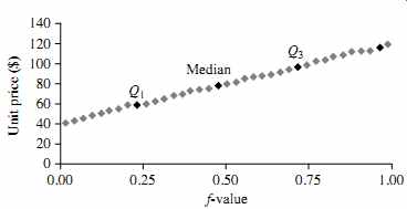
FIG. 4 A quantile plot for the unit price data of Table 1.
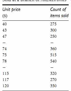
Table 1 A Set of Unit Price Data for Items Sold at a Branch of AllElectronics

FIG. 5 A q-q plot for unit price data from two AllElectronics branches.
Quantile-Quantile Plot
A quantile-quantile plot, or q-q plot, graphs the quantiles of one univariate distribution against the corresponding quantiles of another. It is a powerful visualization tool in that it allows the user to view whether there is a shift in going from one distribution to another.
Suppose that we have two sets of observations for the attribute or variable unit price, taken from two different branch locations. Let x1, : : : ,xN be the data from the first branch, and y1, : : : , yM be the data from the second, where each data set is sorted in increasing order. If M D N (i.e., the number of points in each set is the same), then we simply plot yi against xi , where yi and xi are both .i 0.5/=N quantiles of their respective data sets. If M < N (i.e., the second branch has fewer observations than the first), there can be only M points on the q-q plot. Here, y is the .i 0.5/=M quantile of the y data, which is plotted against the .i 0.5/=M quantile of the x data. This computation typically involves interpolation.
Example 14 Quantile-quantile plot. FIG. 5 shows a quantile-quantile plot for unit price data of items sold at two branches of AllElectronics during a given time period. Each point corresponds to the same quantile for each data set and shows the unit price of items sold at branch 1 versus branch 2 for that quantile. (To aid in comparison, the straight line rep resents the case where, for each given quantile, the unit price at each branch is the same.
The darker points correspond to the data for Q1, the median, and Q3, respectively.) We see, for example, that at Q1, the unit price of items sold at branch 1 was slightly less than that at branch 2. In other words, 25%of items sold at branch 1 were less than or equal to $60, while 25% of items sold at branch 2 were less than or equal to $64. At the 50th percentile (marked by the median, which is also Q2), we see that 50% of items sold at branch 1 were less than $78, while 50% of items at branch 2 were less than $85.
In general, we note that there is a shift in the distribution of branch 1 with respect to branch 2 in that the unit prices of items sold at branch 1 tend to be lower than those at branch 2.
Histograms
Histograms (or frequency histograms) are at least a century old and are widely used.
"Histos" means pole or mast, and "gram" means chart, so a histogram is a chart of poles. Plotting histograms is a graphical method for summarizing the distribution of a given attribute, X. If X is nominal, such as automobile model or item type, then a pole or vertical bar is drawn for each known value of X. The height of the bar indicates the frequency (i.e., count) of that X value. The resulting graph is more commonly known as a bar chart.
If X is numeric, the term histogram is preferred. The range of values for X is partitioned into disjoint consecutive subranges. The subranges, referred to as buckets or bins, are disjoint subsets of the data distribution for X. The range of a bucket is known as the width. Typically, the buckets are of equal width. For example, a price attribute with a value range of $1 to $200 (rounded up to the nearest dollar) can be partitioned into subranges 1 to 20, 21 to 40, 41 to 60, and so on. For each sub-range, a bar is drawn with a height that represents the total count of items observed within the subrange. Histograms and partitioning rules are further discussed in Section 3 on data reduction.
Example 15 Histogram. FIG. 6 shows a histogram for the data set of Table 2.1, where buckets (or bins) are defined by equal-width ranges representing $20 increments and the frequency is the count of items sold.
Although histograms are widely used, they may not be as effective as the quantile plot, q-q plot, and boxplot methods in comparing groups of univariate observations.
Scatter Plots and Data Correlation
A scatter plot is one of the most effective graphical methods for determining if there appears to be a relationship, pattern, or trend between two numeric attributes. To con struct a scatter plot, each pair of values is treated as a pair of coordinates in an algebraic sense and plotted as points in the plane. FIG. 7 shows a scatter plot for the set of data in Table 1.
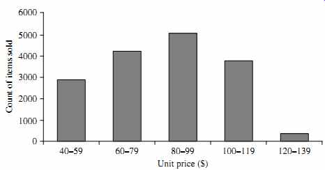
FIG. 6 A histogram for the Table 1 data set.
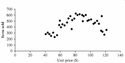
FIG. 7 A scatter plot for the Table 1 data set.
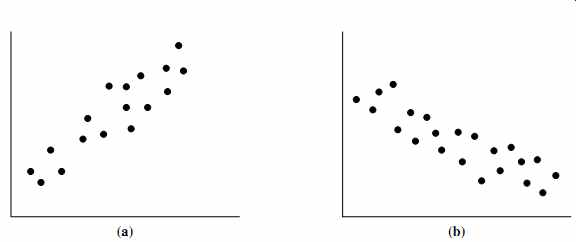
FIG. 8 Scatter plots can be used to find (a) positive or (b) negative
correlations between attributes.
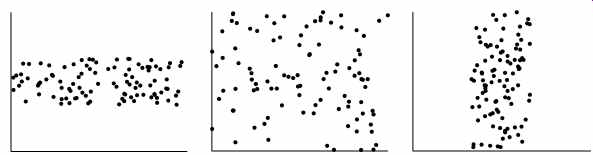
FIG. 9 Three cases where there is no observed correlation between the
two plotted attributes in each of the data sets.
The scatter plot is a useful method for providing a first look at bivariate data to see clusters of points and outliers, or to explore the possibility of correlation relationships.
Two attributes, X, and Y, are correlated if one attribute implies the other. Correlations can be positive, negative, or null (uncorrelated). FIG. 8 shows examples of positive and negative correlations between two attributes. If the plotted points pattern slopes from lower left to upper right, this means that the values of X increase as the values of Y increase, suggesting a positive correlation (FIG. 8a). If the pattern of plotted points slopes from upper left to lower right, the values of X increase as the values of Y decrease, suggesting a negative correlation (FIG. 8b). A line of best ?t can be drawn to study the correlation between the variables. Statistical tests for correlation are given in Section 3 on data integration (Eq. (3.3)). FIG. 9 shows three cases for which there is no correlation relationship between the two attributes in each of the given data sets. Section 3.2 shows how scatter plots can be extended to n attributes, resulting in a scatter-plot matrix.
In conclusion, basic data descriptions (e.g., measures of central tendency and measures of dispersion) and graphic statistical displays (e.g., quantile plots, histograms, and scatter plots) provide valuable insight into the overall behavior of your data. By helping to identify noise and outliers, they are especially useful for data cleaning.