Drawing as an art
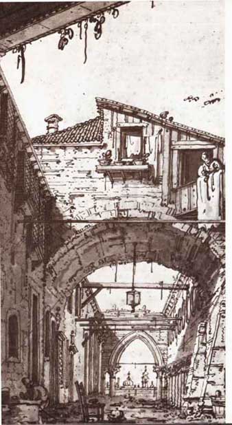
Ruins of a Courtyard,’ a pen drawing in brown ink with gray
wash over graphite by Venetian painter Canaletto (1697—1768), utilizes
linear perspective and strong light and shade.
Pictures scrawled on sandstone, bones, and cave walls indicate that man has been drawing almost since he developed the opposable thumb. For millennia only pointed tools, charcoal from the hearth, and natural chalks were available, and the art was primitive—in ancient Egypt craftsmen sketched on broken pieces of earthenware. Drawing as a fine art, done on silk and paper with ink and brushes, first appeared in China in the fourth century A.D. In the West, however, it was held to have little intrinsic value and was done on wax tablets and other erasable surfaces.
In the 15th century, when paper be came commonly available, drawing began to flourish. By then the quill, which was ideal for sketching, was in general use, and the versatility of pen and paper was demonstrated in many drawings of the old masters.
The discovery of graphite in Eng land in the 16th century gave artists a new medium for drawing. Two centuries later this was much improved by the invention of the “lead” pencil (actually graphite mixed with clay en cased in a wooden stick).
For a long time serious artists considered drawing preparatory to other forms of art, such as painting and architecture. Renaissance artists used pen or chalk sketches to plan their compositions and to work out the de tails of major paintings. During that period drawings were also extensively used as adjuncts to scientific treatises. The greatest of these were Leonardo da Vinci’s architectural, anatomical, and mechanical studies.
Today drawings are valued in their own right and often form an integral part of the work of 20th-century artists. Notable examples are the simple, evocative drawings of Paul Klee, Henri Matisse, and Pablo Picasso.
Basic techniques -- To portray 3- dimensional objects in 2-D, an illusion of contour, distance, and depth must be created. The basic techniques available to the artist to achieve this are outline and proportion, perspective, and light and shade.
The outline is a representation of’ lit outer edge of the subject and of’ lie meeting points of adjacent surface,, color zones, and areas of light anti shade. Inherent in the outline is pot portion, which indicates the relative sizes of the elements in the drawing.
Perspective is the technique used to give flat surfaces the sense of distance and depth naturally perceived by the eye. The use of perspective was finally developed in 15th-century Florence. It was largely absent in the art of non-Western cultures, where elaborate conventions often evolved to resolve the problem. Drawings in ancient Egyptian tombs depict the human figure with the head, legs, and feet in profile; eyes, shoulders, and chest facing front; and lower torso in three quarter view. In old Persian drawings, distance is suggested by objects at different levels, and carpets appear simple rectangles. Traditional Chinese mist-veiled landscapes have virtually no perspective.
The advent of photography contributed much to the understanding of perspective by its ability to mechanically and objectively render three-dimensional space on a flat plane. Subsequently, cubists and abstract artists abandoned perspective in order to express what has been called a non visual, inner reality.
Light and shade can be developed iii a drawing to suggest contour, color, and mass (solidity), as well as to illustrate actual areas of light and shadow around the objects depicted.
==
Tools and materials:
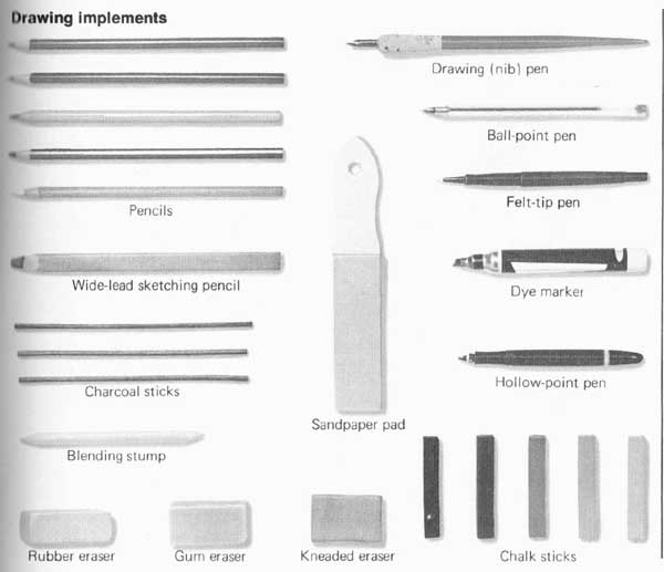
Drawing implements
Pencils
Drawing (nib) pen
Ball-point pen
Wide-lead sketching pencil
Felt-tip pen
Dye marker
Hollow-point pen
Charcoal sticks
Blending stump
Rubber eraser, Gum eraser, Kneaded eraser, Chalk sticks

Line and paper variations
Nib pen on rough paper
Nib pen on smooth paper
Hollow point pen on rough paper
Hollow-point pen on smooth paper
Hard pencil on rough paper
Hard pencil on smooth paper
Soft pencil on rough paper.
Soft pencil on smooth paper
Dye marker on rough paper
Dye marker on smooth paper
==
The most popular and versatile drawing implements are pencils, which come in 17 degrees of softness, from 9H to 6B, with HB and F in the middle.
However, these designations are not precise; the exact degree of softness varies with manufacturers. Soft pencils (2B—6B) are best for freehand sketching. For making very broad strokes use wide-lead sketching pencils or carpenter’s pencils, both of which have flat leads. Your results will also depend on the type of paper you use.
Graphite---Graphite sticks are essentially naked pencil leads. They come with square, rectangular, and round cross sections fit into graphite holders, and are excellent for covering large areas. Sharpen graphite sticks frequently. Cut them at 90-dgr angles with a razor blade, or sand them to shape with a fine sandpaper pad.
Charcoal---Charcoal in stick form is crumbly and messy. Charcoal pencils and black chalk give similar effects and are easier to control. Chalk should be snapped into thirds for easier handling.
Pens---Several types of pens are available for ink drawing. The fountain pen has interchangeable nibs, which makes it adaptable to a wide variety of purposes. Ball-point drawing pens are the same as those for writing, except that they contain special drawing inks. The hollow-point pen, used extensively by commercial artists, has a thin tube for a nib, with a very thin wire inside the tube to facilitate the flow of ink. It produces lines of uniform width regardless of the angle at which the pen is held. Felt-tip pens are refillable and have interchangeable tips.
Drawing papers---A drawing is affected as much by the surface it’s drawn on as by what it’s drawn with. Besides color, the most important characteristic of paper for drawing is the degree of roughness of its fibers, called tooth; tooth determines “bite” (the amount of graphite, charcoal, or chalk taken up by the paper).
For practice you can use a cheap paper stock, such as newsprint. For finished work, however, use either drawing paper or the more expensive bristol paper. Both come in sheets or pads of several sizes. Bristol paper is available with two surfaces: plate (smooth) and kid, or vellum (matte). Both are good for soft graphite leads.
Erasers---Use ink eraser, art gum eraser, or kneaded eraser to correct errors, depending on your medium. The kneaded eraser, which should be stretched and kneaded often, is good for lightening pencil shades or for emphasizing highlights. To clear away eraser crumbs, use a dust brush.
Art supply stores carry tools for various purposes. A drawing board facilitates moving the paper to different angles for easier sketching. A French curve, a square, and a compass can be useful for precision work. To keep a finished drawing from being smeared or soiled, spray it with a fixative. Pastel and acrylic fixatives are also good for pencil and charcoal drawings. Avoid charcoal fixative, which may eventually turn an amber color.
+++++
Drawing
Grid copying
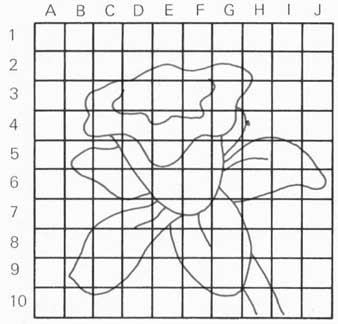
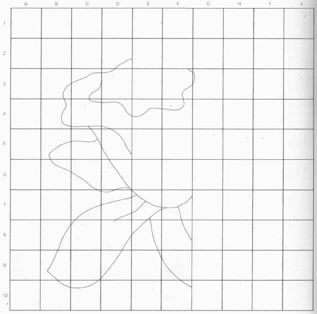
Transfer design one at a time, starting with any square such as
0-2. Mark copying grid wherever a line in original intersects corresponding
square. Then, guide a by these marks, draw the lines inside each square.
You can make an accurate copy of any picture in virtually any size.
You can easily make a same-size copy of a picture simply by tracing it. But if you need a precise scale copy (larger or smaller) of a picture, the grid method is the easiest way to draw it accurately and in the right proportions.
Begin by lightly penciling a grid on the original, or draw a grid on a piece of tracing paper and superimpose it on the picture. (Examples of designs with such overprinted grids are found as patterns in other sections of this book.) The copy can be exactly the same size as the original, or enlarged or reduced, depending on the dimensions of the squares in the copy’s grid.
Draw the grid for your copy lightly in pencil so that it can be erased later. It’s absolutely essential that the grid on the original picture and the grid on the copy be proportional to each other (that both have the same ratio of length to width) and that each grid be formed of the same numbers of vertical and horizontal lines and thus have the same number of squares.
Here the original drawing (above) has been overprinted with a grid, and a larger grid (right) has been constructed, with the same proportions and the same number of lines but with larger squares, to make an enlarged copy of the picture.
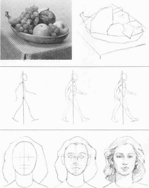
Outline and proportion:
To draw accurately from life, it’s necessary to first construct a freehand out line establishing the general proportions of the object or figures in the scene you are observing.
For a beginner this can be a major stumbling block. Normally, when we look at an object, our eyes take in all its details as part of the whole. In sketch a simple object, such as a pitcher, the beginner would probably draw its ‘outline by tracing from a particular point, continuously and in faithful de lid, all-around the outer perimeter. But such an outline invariably warps the object’s proportions, resulting in an in correct interpretation of its shape.
To construct an outline properly, you must learn to use your vision analytically. First look at the general shape, ignoring such features as, in the case of the pitcher, the spouts and the handle. Ask yourself: Can the object be enclosed in a square, circle, triangle, or rectangle? What is the rough ratio between its height and width?
To translate your perceptions onto drawing paper, first make light marks it the top and bottom and on both sides Ito define the boundary of the outline. I hen, using many separate, intersecting straight lines, block out the whole shape, keeping all the major proportions in mind. These lines should be drawn lightly and quickly, with the arm sweeping from the shoulder.
If the whole shape fits into, say, a large rectangle, then in your mind’s eye divide the rectangle into smaller rectangles. These smaller units will help you establish the proportions of the parts of the object within the outline of its overall shape. Depending on the shapes involved, you can also use squares, circles, or ovals to block out these parts. In this way, working from the largest shape gradually to the smaller details, you can construct a reasonably accurate freehand outline.
In drawing from life, as in the case of this still life (shown in the photograph at left), begin by marking off the boundaries of the overall shape with four short lines. Employ a series of intersecting straight lines—not one continuous line—to block in proportions of smaller shapes within the outline.
Finally, begin to sketch the picture in full detail.
Drawing a human figure is made much easier by first sketching a stick figure. The stick figure determines the right proportions for the torso and limbs and properly places the joints. Note that the walking figure at left has its gravity line (the vertical line through the center of gravity) midway between its two feet.
To draw a face, begin by drawing an oval. Next, determine the proportions of the features Mark a horizontal line across the middle to indicate position of eyes and tops of ears Draw a vertical line down the center. Midway between eyes and chin draw a horizontal line for base of nose. One-third to one-half way from nose to chin draw line for mouth.
Perspective:
A drawing is done on a piece of paper, a two-dimensional surface. To suggest three-dimensional reality, the artist employs perspective.
Perspective simulates the way things appear at various distances from and angles to the viewer. For example, buildings at the end of a street look not so tall as those nearby, even when all are of the same height. And when a cylinder is tilted, its circular base appears oval, not circular. A realistic drawing utilizes special techniques to show these effects.
The theory of perspective is based on complex mathematical principles. Only the most basic aspects of the subject are covered here.
One-point perspective --- Perspective is most obvious in pictures containing forms with straight lines, such as houses, straight highways, or railroad tracks. When one side of such a form— say, a house—is perpendicular to the line of sight, the other visible sides (those parallel to the line of sight) appear to recede toward a vanishing point on the horizon. At this point, all these lines, or their extensions, meet. This is called one-point perspective.
Two-point perspective --- When the vertical planes of an object—say, the walls of a house—are at angles to the line of sight, these lines or their extensions will meet at two different points on the horizon. The drawings on this page illustrate the sketching techniques used in blocking out scenes in oil in two-point perspective.
Three-point perspective --- A 3rd vanishing point comes into play when the walls of a house are at angles to the line of sight and the top is tilted toward or away from the viewer. This would occur on the street looking up at a tall building or in a plane looking down, situations more suited to wide-angle photography than to drawing.
One-point perspective --- The sides of a cube (or the walls of a room) are blocked out using one- point perspective. Because the cube is seen head-on, there is only one vanishing point.
Two-point perspective --- Because cube is seen at an angle, lines extending from its walls meet at two vanishing points on the horizon. Tilt cube to see three-point perspective. In this view of the same street scene as above, the line of sight does not parallel the street; thus, the drawing employs two-point perspective.
Light and shade:
A line drawing, even with proportion and perspective, may not convey a convincing illusion of depth. And perspective is of no use in imparting a 3-D effect to rounded or spherical forms rendered in 2-D. An illusion of depth and of highlighting can be created through high lighting and shading.
Cross-hatching, stippling, and other shading and highlighting techniques are illustrated on the following page.
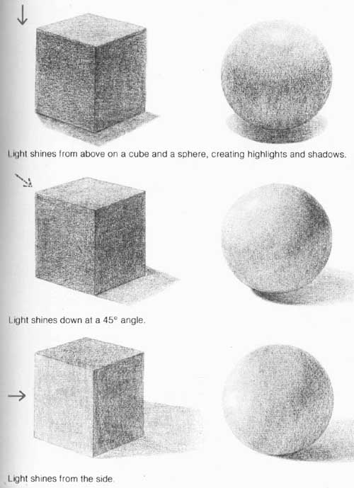
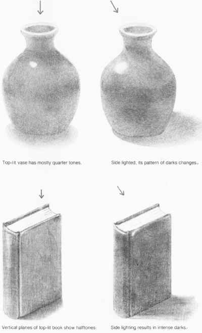
The illustrations on this page show where the darker and lighter areas will occur on different forms and surfaces with respect to the direction of the light source illuminating them.
The technique of creating dramatic contrasts with light and shade, called chiaroscuro (an Italian word meaning, literally, “bright-dark”) was highly developed by Renaissance artists in drawings and paintings. Rembrandt was the greatest master of chiaroscuro.
Light shines from above on a cube and a sphere, creating highlights and shadows.
Light shines down at a 45° angle.
Light shines from the side.
___Top-lit vase has mostly quarter tones.
Side lighted, its pattern of darks changes.
Vertical planes of top-lit guide show halftones.
Side lighting results in intense darks.
Drawing techniques:
The vocabulary of drawing consists of a variety of lines, thin or thick, straight or sinuous, bold or delicate. Different kinds of strokes can be used to suggest the solidity of granite slabs, the surface texture of Ming porcelain or the sun- dappled foliage of a maple tree.
To depict areas of varying brightness resulting from an interplay of colors and lighting, the artist makes use of a technique called toning. So-called true tone is attained by a form of shading in which the individual pencil lines are merged. In the case of charcoal, the lines can be smudged. So-called illusory tones are obtained by means of closely spaced lines or dots. The dot method is known as stippling.
Tones can be flat, as on a wall receiving and reflecting the same amount of light across its entire area. Graded tones, on the other hand, are used for uneven effects. For example, shading can suggest shadow on a sphere.
A drawing can be elaborately delineated like a painting, with detailed renderings of textures, color tones, and patterns of light and shade. Or a drawing may be just a few well-placed, spontaneous lines that bring out the essence of the objects depicted. A good drawing is an effective orchestration of lines. Even a simple work may combine two or more shading techniques to suggest light’, shadow, and form. The apple drawing on this page, for in stance, done with graphite pencil on bond paper, contains both simple strokes and crosshatches (patches of fine intersecting lines).
Papers --- A variety of drawing papers are available in art and stationery stores. These include bond papers with a high rag content, which, like vellum, offer a smooth, nonporous surface that is ideal for pen-and-ink. Vellum has the additional advantage of being transparent, so that it can he used for tracing. (The finished drawing is then mounted on an opaque white paper or board.) Bond is also ideal for pencil drawings, but interesting effects can be achieved by experimenting with pencil on rougher papers, such as those traditionally employed for charcoal. The apple drawings on this page demonstrate the different effects of using pencil, pen-and-ink, and charcoal on smooth and rough papers.
Pencil drawing --- Make your first drawings using just three grades of graphite pencil: HB, 2B, and 3B. Experiment with both round and flat leads. Sharpen leads into conical as well as chisel points.
Charcoal drawing---Charcoal offers a soft texture and a deep black that are not easily achieved with other drawing mediums. Charcoal pencils are used like graphite pencils, but charcoal sticks require a quite different technique. The sticks should be used in 1-inch lengths, broadside, for toning and for merging tones. Don’t draw lines between two tones. Use lines only when absolutely necessary. To merge or soften tones, smudge them with your finger. To highlight dark areas, use piece of kneaded eraser. An easily smudged charcoal drawing can be protected by spraying it with a fixative after it completion.
Pen-and-ink drawing --- Ink lines are sharp and precisely defined. The techniques for drawing with a pen are similar to those for pencil, but with ink you cannot differentiate tones by varying the pressure and the grade. You can, however, vary the thickness and spacing of pen strokes. Lightly sketch the outline with an HB pencil beforehand.
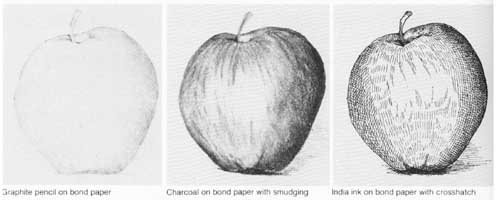
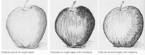
Graphite pencil on rough paper
Graphite pencil on bond paper
Charcoal on bond paper with smudging
India ink on bond paper with crosshatch
Charcoal on rough paper with smudging
India ink on bond paper with stippling
Stages in sketching:
Shown on this page are two parallel sequences of three stages in the execution of a still life. One is done in charcoal, the other in colored pencil.
The outline in the charcoal sketch is a flat and totally linear portrayal of a bowl with pears, apples, and bananas. The outlines of the bowl and of the fruit are formed by many short, straight lines, revealing the rough shapes and proportions of the objects. Initial toning is done in the second stage—closely spaced strokes are used to fill in all areas except those with highlights. As part of this process, some of the outline is merged with the strokes.
In the final stage the finished toning is achieved by smudging the charcoal with a finger to give uniformity and gradation to the shading. Additional highlights are created with a piece of kneaded eraser. The tones are then graded further by adding charcoal to deepen the darkest areas. These steps result in a suggestion of depth and contour in the still life.
The first sketch in colored pencil is outlined in a similar manner to the charcoal sketch, except, of course, that colors are used. In the initial toning the artist uses “true” tone for the bananas and the bowl, parallel strokes for the apples, and a mixture of strokes and crosshatches in green and yellow for the pears. In the final stage the bananas are shown to be ripening by the addition of spots of brown toning, and the pears and apples are made to stand out realistically with further toning by means of strokes as well as crosshatches.
In drawing with colored pencils, it’s not necessary to use the exact shade of a particular hue, as essence may be more important than photographic ac curacy. Because it’s difficult to apply colored pencils evenly to large areas, close parallel strokes, repeated without excessive pressure, are generally used.
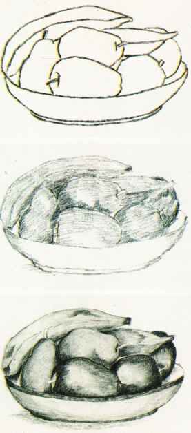
Charcoal
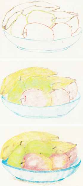
Colored pencil, Pastel
In its soft brilliance, pastel differs from colored pencil. Pastel can be classed either as painting, when blending and smudging achieve the effects of paint, or as drawing, when linear features predominate.
Originating in northern Italy in the 16th century, pastel reached an early peak of popularity among portrait painters in 18th-century France. By the late 19th century Degas and other French impressionists had begun to develop a new approach to pastel, which emphasized individual strokes and the juxtaposition of colors with little or no blending.
Pastels are pure pigment powders mixed with a light binder and shaped into soft sticks. They are used on charcoal and pastel papers that have pronounced tooth or on velour papers with flocked finish.
Minor errors in pastel strokes are not corrected by going back over them, as this would result in a non-uniform tone.
Rather, the sticks are held over the area and rubbed on a clean, fine sanding pad to produce loose powder; the powder is then rubbed with the finger to achieve an evenly tinted area. More serious errors can be corrected by blot ting them with a piece of kneaded eraser until the loose pastel particles are removed. The area is then rubbed gently with powder as described above.
The disadvantage of pastel is that the dusty powder does not adhere well to paper, and spraying with fixative alters the colors. The best way to preserve a pastel is to frame it tightly under glass.

A sketch is made of a pepper, an artichoke, tomatoes, carrots,
and radishes with a sepia conte crayon on steel-gray paper. The sides
of paste sticks are worked along the edges of the vegetables to fill
in the darker parts and some middle tones. More colors are added to the
tomatoes and carrots while middle’ tones are given to the bodies
of green vegetables
 A white pastel stick is used to add highlights to the vegetables
where some reflected light rays are observed by the artist. Most parts
of the drawing are smudged gently with a stump (pointed rolled paper)
or with the finger for larger areas. Blue is given to the background
and parts of the vegetables. The highlights are put in again and all
vegetable edges are refined.
Dye marker:
A dye marker is a small cylinder of liquid dye topped with a felt or nylon lip. It’s a relatively new drawing implement that is used extensively by poster and commercial artists.
The techniques of using the dye marker are relatively simple. It produces strokes that are dictated by the size and shape of the felt or nylon nib. The color intensity of any one marker cannot be varied, but a large and growing assortment of colors is avail able. The markers come with water- soluble or oil-based dyes; the two kinds should not be mixed in the same work. as they have very different characteristics and don’t blend.
Dyes soak through papers and tend to bleed into one another. A special dye paper, which is relatively nonporous, can be used to limit soaking; however, this paper may cause drawings to appear thin and streaky.
Another problem in using markers is that the dyes are so volatile that they evaporate quickly. It’s therefore a good practice to uncap a marker only when it’s to be used and to recap it immediately after use. It’s possible as an emergency measure to revive briefly a marker showing signs of dryness; simply moisten its tip with a few drops of some solvent such as acetone, lacquer thinner, or pen cleaner.
The intensely colored dyes, once put on paper, are impossible to erase except with a bleach. Such a practice is not advisable, as the bleach must be used with great care and skill to pro duce acceptable results.
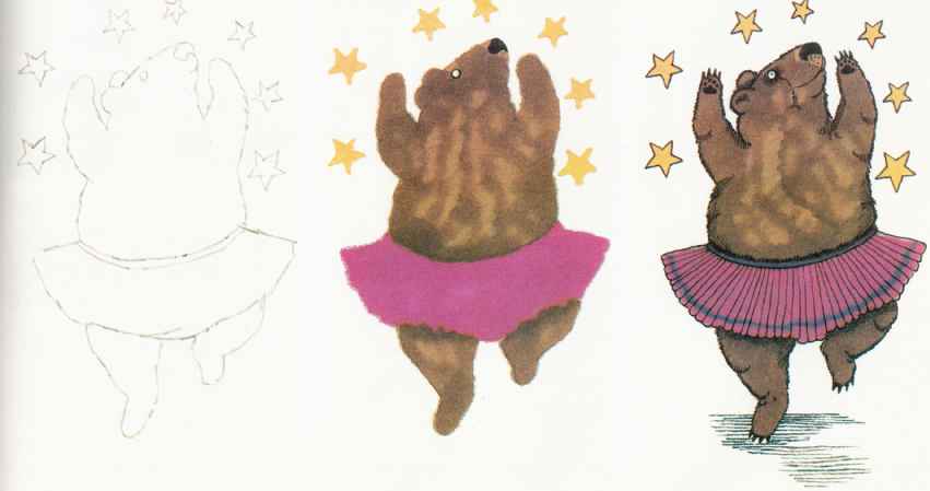
Working in a broad, comic style such as might be employed in
a children's guide illustration, the artist sketches the dancing bear
and stars in soft pencil.
The artist fills in the large areas of color. First, the bear's body is colored in light and dark brown dyes. Its skirt is done in red-violet, snout and eye in black, and stars in yellow.
A border of blue-violet is applied to the skirt. A sharp-tipped black dye marker is used to draw the pleats of the skirt and the paws, as well as to create shaded areas.
This guide adapted from Reader's
Digest -- Crafts and Hobbies: A Step-by-Step Guide to Creative Skills
(1979)
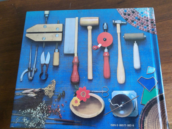
Published in 1979 by Reader's Digest, ISBN 0-89577p-006306. A useful topical reference! If you like crafting or want to learn, this book will give you the know-how you need to create just about anything. Stained glass, jewelry, painting, papier-mache, metalworking, basketry, mosaics, pottery. If you want to know how to do a craft, chances are, it's in here.
Prev.: (none) | Next: Color and design
top of page | Similar articles | Home Page


